When your branding is good, your user base can trust your content. I saw a site that needed some help in 2019 so I decided it give it a make-over. It was easy to find the UGA branding standards online, so I rolled up my sleeves and gave it a try! I am still really happy with the results, but I’ve touched it up recently to make it better. You can always improve! If you want to check it out you can click this: UGA branding / site rework exercise
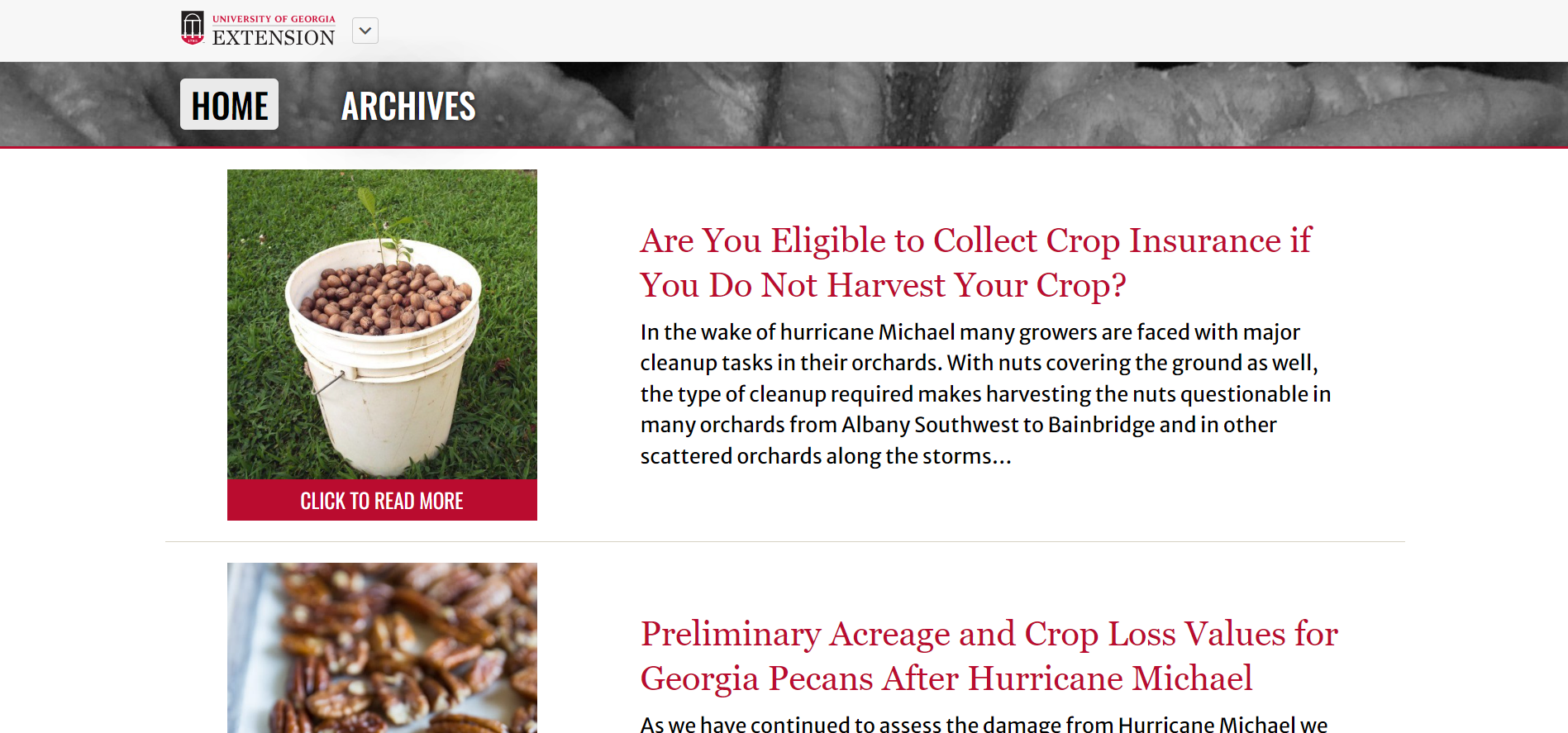
When you first load the page you can see the original Pecan Extension site with an added utility bar at the top. If you click the button that says ‘Slightly Updated’ the site will make some small accessibility and compliance changes. This was to showcase how I can take existing sites and rehabilitate them with very few changes. If you click the ‘Complete Rework’ button you’ll see my suggestions for a more interactive and engaging site. Featuring thumbnails in the listed blog posts and a very navigable archive page, the complete rework gets great accessibility scores and engages audiences.
Looking at the UGA Pecan Extension site today, I can see a few improvements have been made since I last looked at it.
If you want to see how it looks today, click this: UGA Pecan Extension site
I think both designs have merit in their own ways, and I’m glad to see some similarities! Those fonts and spacing choices really take it up a notch, and the accessibility score lighthouse gives it is great.
